Understanding the Question Settings #
NestForms allows you to customise the Question Settings within each form component to optimise data collection and improve user experience. These settings let you control how questions appear, apply validation rules, and manage visibility options to ensure accurate and relevant responses.
Whether you're adjusting display options, setting required fields, or applying Skip Logic, the Question Settings will provide flexibility for building dynamic and efficient forms.
Text Question Settings #
The Text question is commonly used within many forms.
Click on the ![]() icon to open the question.
icon to open the question.

Now you have opened the question you will find various settings. These settings will vary depending on which question you have decided to include on your form.
- 6 Dot icon - Re-position the question anywhere within the form.
- Text field - Enter the name of you question. Simply click into the text and edit.
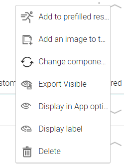
- 3 Dot icon - Provides a dropdown menu with various options.
- Arrow down - Open the question.
- Type select - Choose the format for some form components.
- Main Settings - The main settings fields depending on which component is used.
- Additional fields - A aange of checkbox options depending on which component is used.
6 Dot Icon #
The 6-dot icon ![]() allows you to rearrange questions within the form builder by dragging them into the desired order.
allows you to rearrange questions within the form builder by dragging them into the desired order.
How to use this icon:
- Locate the 6-dot icon on the left side of a question.
- Click and hold the icon to activate the drag function.
- Move the question to the preferred position within the form.
- Release to drop the item in place.
This feature helps maintain a structured and organised form layout, making it easier to adjust form flow as needed.
Text Field #
The Text Field allows you to add and edit text within a question.
How to Edit/Add Text:
- Click inside the Text Field to enter or modify text.
- Type the desired content, such as a question or instruction.
- Changes are saved automatically as you edit.
This feature ensures clear instructions and easy text customisation within your forms.
3 Dot Icon #
The 3 dot-icon ![]() provides a menu with multiple settings:
provides a menu with multiple settings:

Arrow Down #
The Arrow Down Icon ![]() expands a question to reveal additional settings and customisation options. These settings are explained below.
expands a question to reveal additional settings and customisation options. These settings are explained below.
Type Select #
Type Selectors allow you to choose the format for specific form components, ensuring the correct data input method. The type selector appears within the following components:
- Text - with options Single Line, Multiple Lines and Email
-
Feature Button - with options Finish, Clone Section and Save
- GPS - Allows you to capture location data in different format.
- Number - Users can enter numeric values in different formats.
-
Autocapture - The Autocapture Component automatically fills in data based on predefined settings.
Main Settings #
- Options - Allows you to manage answer choices to Single answer, Multiple-answers and Dropdown components.
- Custom DB - A pre-defined database that autofills structured data into forms.
- Skip Logic - Shows or hides questions based on a user's previous response.
- Button Name - This field within in the Feature component allows you to customise the text displayed on the button.
- Allow map select - Enables responders to choose a location on the map instead of relying solely on GPS coordinates.
- Required precision - Sets the accuracy level for GPS coordinates, ensuring location data meets specified detail requirements.
- Keyboard type - Within Text the Keyboard Type defines the input layout for a field, text, numeric, email, etc.
Additional Fields #
- Custom DB - A pre-defined database that autofills structured data into forms.
- Placeholder - A text prompt provided within the response. See more on the Text help page.
- Required - Ensures a form field must be filled before submission.
- Validation Rules - Define the format or constraints for a response. See more on the Text or Images help page.
- Skip Logic - Shows or hides questions based on a user's previous response.
- Set Values - Assign numerical or predefined values to answer choices for calculations or data processing. You can set values within Single answer and Multiple-answers components.
- Maximum options - This checkbox in the Multiple-answers component limits the number of selections a responder can make.
- Autocomplete - Allows responders to quickly find and select options by typing keywords within a Dropdown question.
- Filename - Within the Images component you can customise the name of uploaded images.
- Disable Images from the device gallery
- Keep EXIF - Preserve metadata, including GPS location, timestamps, and camera details, when uploading Images.
- Lock previous components - Ensure data can not be altered after the approval Signature has been added.
- Minimum and Maximum Number Ranges - Within the Number conponent this sets limits on numerical inputs, ensuring values fall within a specified range.
- Allow Decimal - Enables responders to enter decimal values instead of whole numbers in a numeric input field. See the Number help page.
- Add Logic - Applies conditional rules to show, hide, or modify form components based on user responses. View the Number help page.
- Date format - Date format defines how a date is displayed and entered, such as DD/MM/YYYY or MM/DD/YYYY.
- Hide Current Date Button - Removes the option for responders to auto-select today's date.
- Hide content/Scan only/Allow multiple - You can find more details on these options within the Barcode & QR code scanner help page.
- KML Files - Allows for geographic data input, including points, lines, and shapes, for mapping and GPS application.
- Button Name in the Feature component allows you to customise the text displayed on the button.


