The Text component is used in many forms and allows you to enter free text within a field either in single or multiple lines.
The component is perfect for inputting text such as first and last names. It may be the name of a specific manufacturer or client company. You may want to enter text for addresses or locations within a building or a large estate. There may be occasions when letters and numbers are mixed such as is seen on some item serial numbers.
This is how the component looks when set into the form by the administrator.

Add a title to the component by clicking into the Text field.
Choose to insert text either in Single or Multiple lines, there is also an Email option.
- Single Line – For short text entries like names or job titles.
- Multiple Lines – For longer responses such as comments or descriptions.
- Email – Ensures responses are in a valid email format (e.g., name@example.com).
Keyboard type #
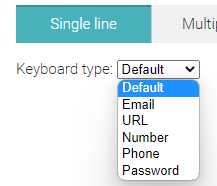
Underneath the Single line option which is the default setting you can see a Keyboard type dropdown menu. Selections from this option will allow responders on the ground to use different keyboard types according to your requirements.
For example, you can set a numerical keyboard to appear for phone numbers rather than the standard keyboard. This makes the survey more efficient as the user doesnt have to switch keyboards.
You can insert text by staying with the default option. There are five other input types available within the dropdown:

1. Email - The user can enter and edit an email address. The keyboard will change accordingly into the input type you have chosen.
2. URL - Used to let the user enter and edit a valid web address. The keyboard will change accordingly.into the input type you have chosen.
3. Number - Only the numerical keyboard will appear if selected.
4. Phone - Used to let the user enter and edit a telephone number.
5. Password - Provides a way for the responder to securely enter any data by hiding the characters entered.
Additional Fields #
- Custom DB - Internal database that auto-fills form fields with preset data. Learn more about Custom DB.
- Placeholder - This feature allows you to provide a text prompt for the responder.
- Required - This checkbox can be used when an answer must be inserted by the responder. When ticked, an input field appears that allows you to set the minimum number of characters required.
- Validation Rules - This is when there is a text entry from a responder, you can set specific rules to be followed. Learn more about Regular expression validation.


