Introduction #
The Dropdown component is similar to the Single Answer component and will allow for one choice only to be selected from a longer list of options. Single answer is best used for shorter lists of choices.
The Multiple answer component allows a person to make more than one choice from a list of options.
For questions with more than one option #
The Multiple answer component allows for the selection of more than one choice from a list of options. For example you may want to know which type of music a person likes and provide a list. Let's say the list contains ‘Blues, Rock, Pop, Folk, Jazz and Classical’. The Multiple answer component allows them to select more than one option. A music lover might even want to select them all.
The Single answer and Dropdown components can be used for short and longer lists but allow for only one option to be selected by the person being interviewed.
How can I modify the component to suit my requirements? #
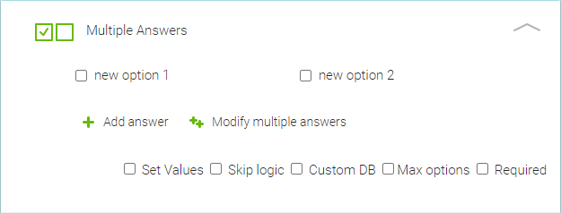
This is how the component will look once the administrator has dragged and dropped it into a new form.

By clicking into Multiple answers, you can insert text and provide the question for the choices.
By hovering over the New option fields you can set up the relevant choice options for the data required by clicking on the pencil icon. You will also see an icon for Adding an image from the gallery and a Delete icon should you wish to remove the option.
You can easily create more choice options for the interviewees by clicking on +Add option and go through the same process.
When you click on Modify multiple options you can separate the options with a new line. Modifying multiple answers is very helpful when you have a longer list of the answers or if you need to copy the options from one question to another. You can also reorder the answer options in the popup window or if you want to make the list alphabetical, just click on the A-Z button in the top right corner of the pop up.
You can see four checkboxes at the bottom right of the component.
Set Values: allows you to set a numeric value within the individual answer option for calculation. Find out more about this option on the calculate help page.
Skip Logic: Allows for setting Skip logic.
Custom DB: Allows you to prefill your own internal DB data into the NestForms responses. This can be an Excel document or CSV that you have exported from your own internal Database.
Max options: Allows you to limit the number of choices that can be selected by a responder or interviewee. Set the limit with the counter that appears once you check this box.
Required: Checkbox Required lets the responder know that the question must be answered. If the Responder leaves the question without an answer, and presses Finish, the error appears and the response cannot be finished until the question is answered.
Multiple answer component used in a Music survey #
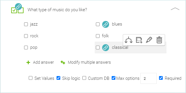
This is how our ‘Music’ question example might look like depending on the administrators requirements.

In this example Skip logic has been applied. Should you choose blues or classical, the person can then be asked who their favourite artists or composers might be.
Data collection by the responder #
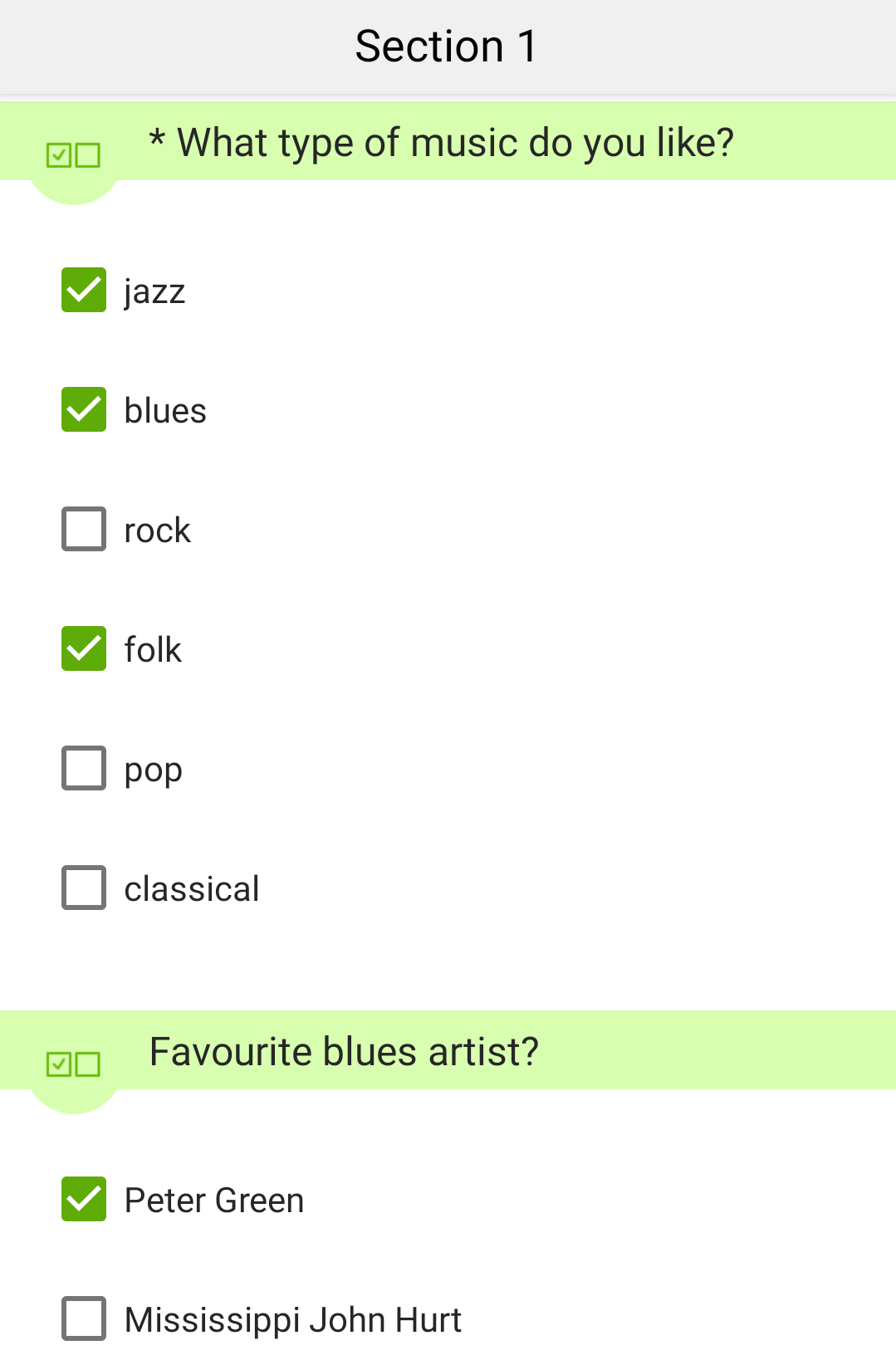
Here is how it might look for your responder on the app once the interviewee has given their choices.

The Multiple answer component is very easy to use both for the administrator creating the form and the responder collecting data on the ground. You can also learn the full list of the components and their uses within the NestForms app.


