There are various options that can help refine how your numerical data is formatted. Below is a selection of formatting options available to you when creating your forms.
If you require the responder to enter a number into any question, it is best to use Number instead of the Text component. When using the Number component we display the numerical keyboard in the app and are able to display charts from this field in the form responses within your web account.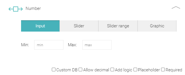
When you click on the dropdown chevron to open up the component you can add a title by clicking on Number. As an example you could use titles such as Length for the first Number Component. The next Number component below could be titled Height, the next Width.
Below the title field you will see four options. These are:
- Input
- Slider
- Slider range
- Graphic
Underneath the first three options the administrator can insert a Minimum or Maximum number range. You can specify the minimum and maximum number from within which your responder can select a number. It is a required field for the Slider and Slider range types.
There are a further five checkboxes within the component:
- Custom DB - allows you to prefill your own internal data into your NestForms responses.
- Allow decimal - Selecting this option will define numbers in decimal format. When you have checked the box, another field will appear that allows you to input the number of decimal places.
- Add logic - See Number logic further down the page.
- Placeholder - This feature allows you to provide a text prompt for the responder.
- Required - Check this box when an answer must be inserted by the responder.
This is how The Input, Slider and Slider range options display in the app.
Input #
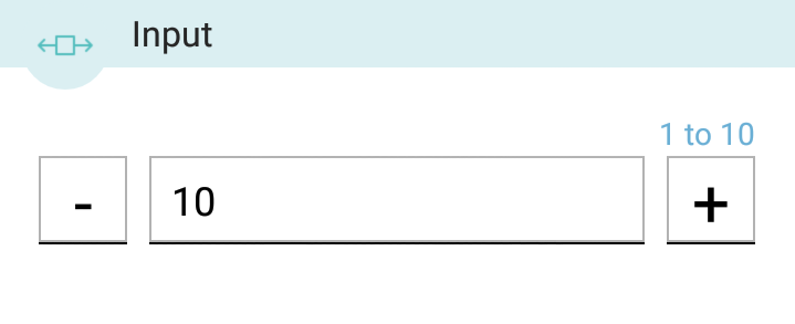
When the administrator selects Input for the form a number key keypad will appear for your responder in the app if they click directly into the box. They can insert the number directly into the box or, alternatively they can insert the number using the - and + symbols.
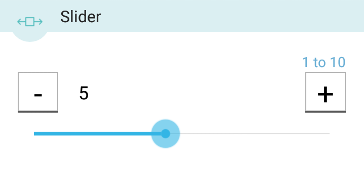
Slider #
Allows you to set a numerical range. (eg. a range of numbers from 1 to 10). When you tap the screen between the - and + symbols a cursor will appear allowing you to input a number manually.
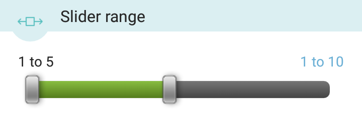
Slider range #
Allows for a numerical scale which will allow your responder to drag a button to the required numeric range.
Graphic #
The fourth option within the Number component allows you to create Graphic rating scales. By selecting from a variety of dynamic icons, survey creators are able to enhance their surveys for responders and interviewees in an eye-catching manner.
Click on the Graphic Button.
Customisable Icons:
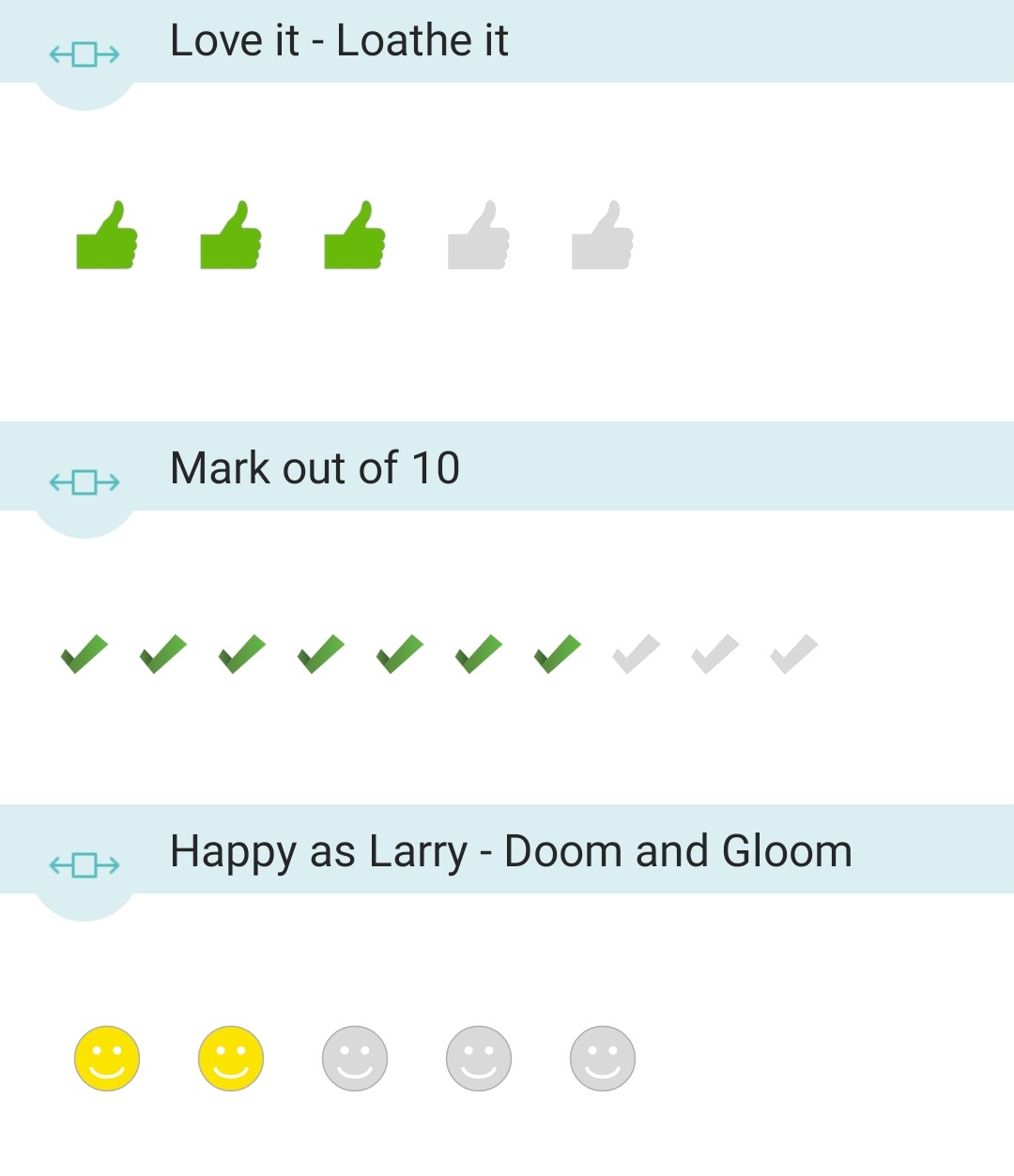
Users can select a Graphic rating scale from a range of coloured icons. You can choose from the following icons:
- Thumbs up
- Smiley face
- Stars
- Ticks
Whether you prefer a playful smiley face, thumbs up or more professional-looking ticks. With this customisation, you can make the graphic representation more appropriate for the style and intent of the question you are asking. Additionally, you can design and select your own icons from your image gallery. Here is how some examples appear in the app:
Size and Number of Icons:
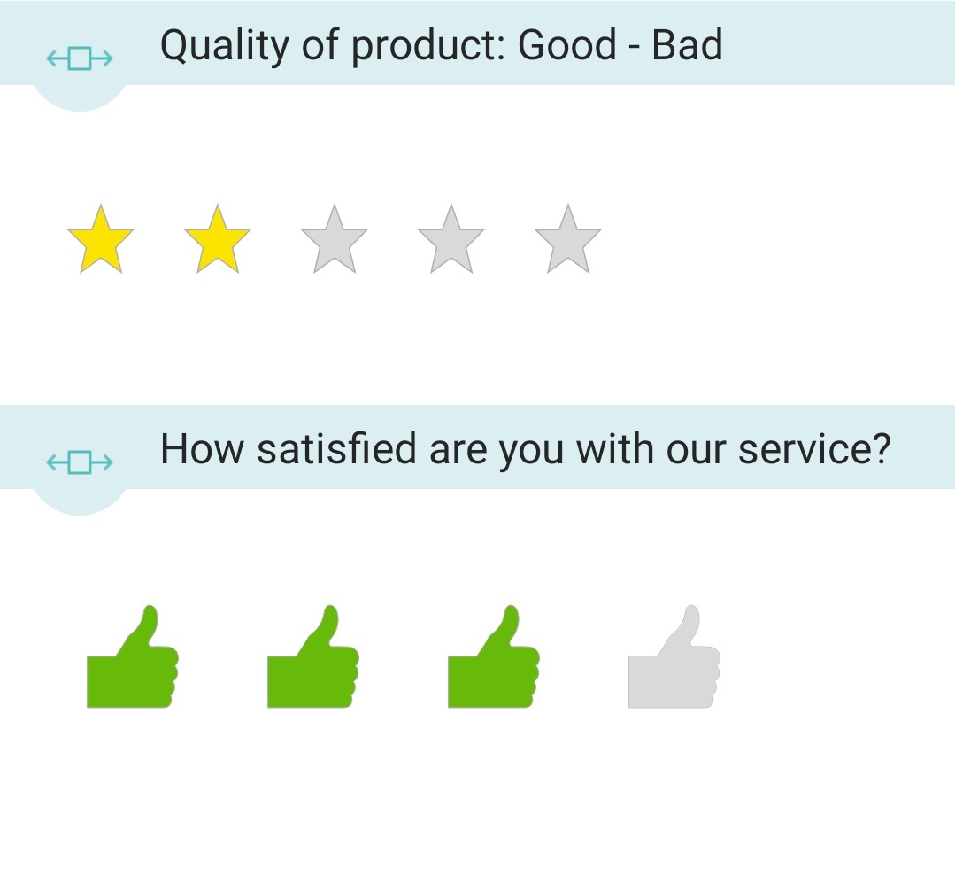
You can also choose the number and size of the icons. You also have options to adjust the size and number of icons displayed within each question. This granular control ensures that your rating scale aligns perfectly with the specific requirements of your survey.
Number logic #
If you want to display feedback text depending on the value you have entered, you can do this by adding Number logic to your number component.
You can simply specify the breakpoint number and enter the feedback text that should display when the result is either inside or outside parameters you have set.
Based on the set breakpoint, it is also possible to display a different image or alternative followup questions similar to using skip logic.
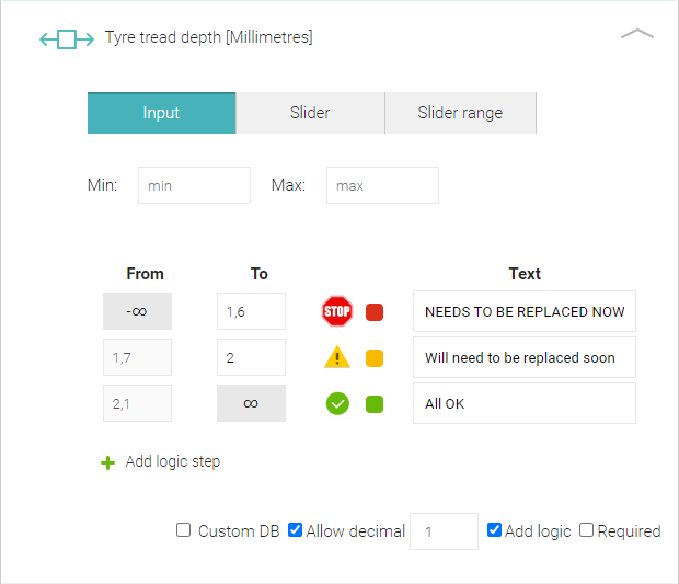
Start by clicking Add logic in the form builder within your number component. Then click Add logic step, enter your value and confirm by pressing the Add button. Then based on your requirements, you can define the text to appear, colour of the text, assign an image or apply skip logic.
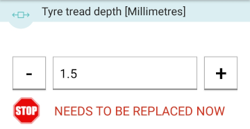
For example, let’s imagine you are performing safety checks on your company vehicles and your intention is to gauge the tyre tread depth as to whether it has exceeded the minimum safety limit for safe driving.
