The Comments component provides you with a simple way to collect comments from your responders on the ground.
Single or multiple comments can be added.
This is how the component looks when you add it to your form.

When you click into Comments, you can then change the title heading to make it more relevant to your form.
Required - The ‘Required’ checkbox lets the responder know that the question must be answered. If the Responder leaves the question without an answer, and presses Finish, an error appears and the response cannot be finished until the question is answered.
Validation Rules - You can specify rules for the text entered into the responses. You can find out more on the Regular Expression Validation help page.
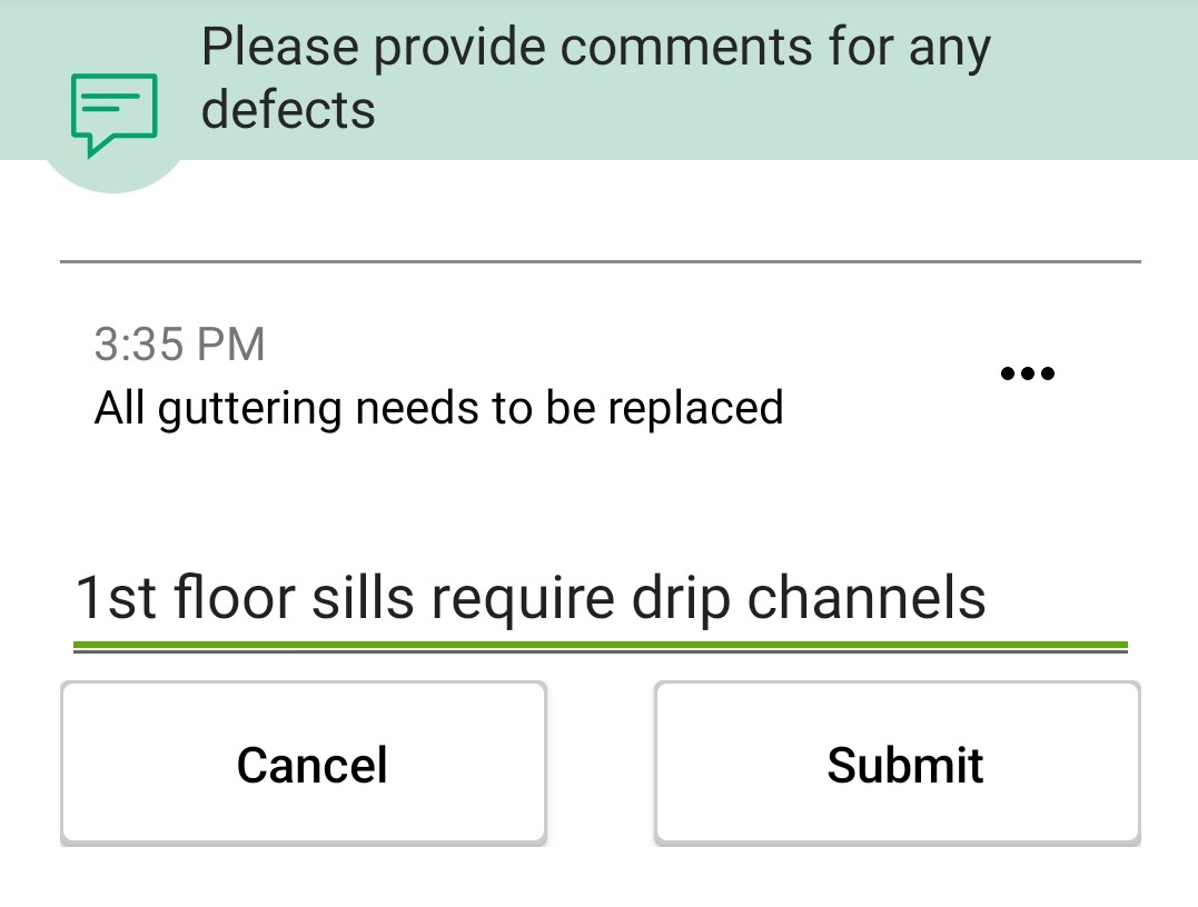
Inside the app:

When you press the Add a Comment button, you will be able to enter one comment. Then you can press the button again to add another comment. Any texts can be later on eddited by clicking the three dots on the right hand side.


