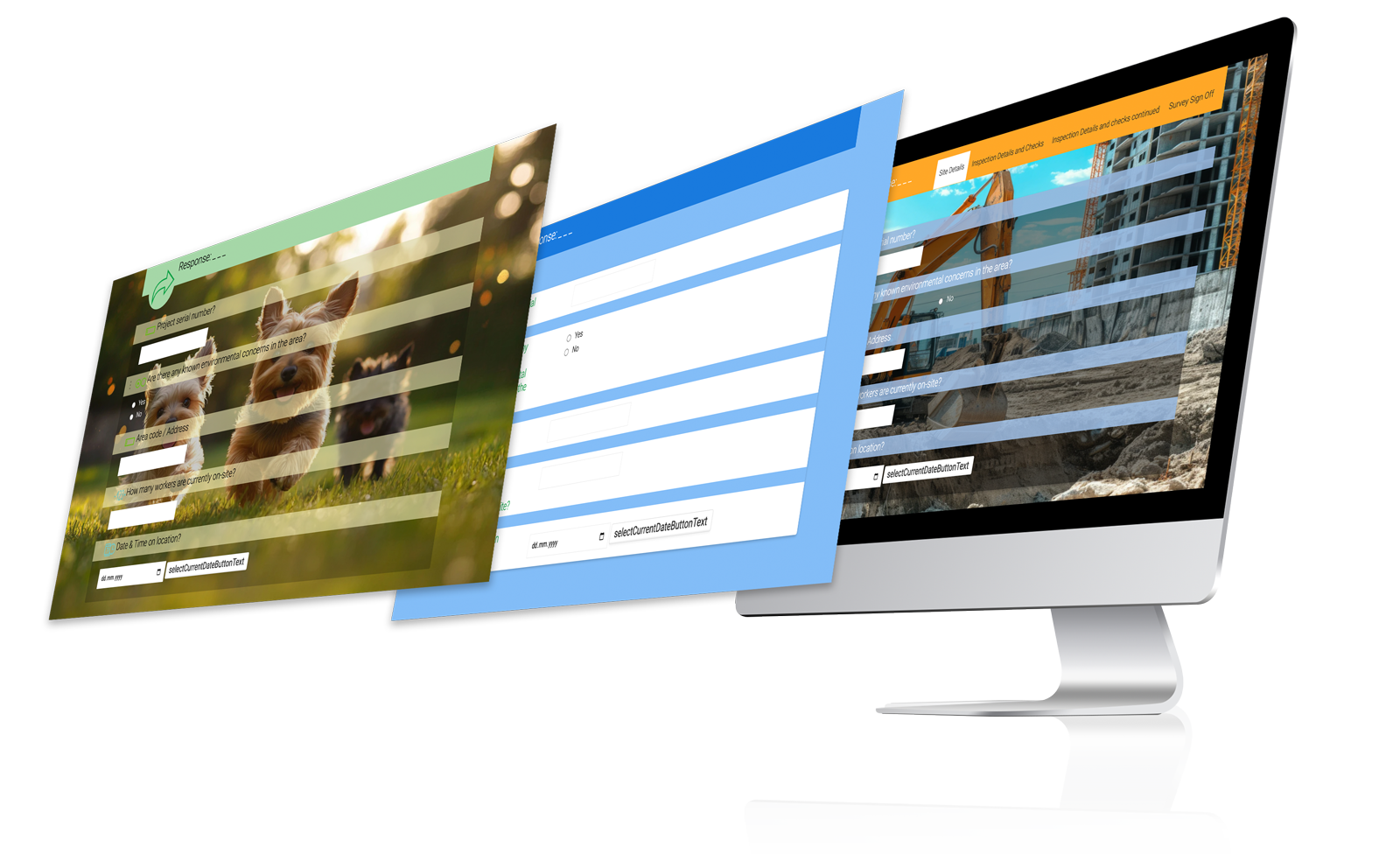
With this feature, it's possible to tailor the colour and style of your online Public form response. You can create your own style from scratch or use one of our predefined themes and personalise it to suit your requirements.
Themes #
You can choose a predefined theme that gives the form a professional appearance, or, you might require a more vibrant and playful look.

Copy from another form #
When you have an 'appearance style' already configured for some forms, they will be listed here, allowing you to easily copy the setting from one form to another. This section will remain hidden until you have at least one form with a custom appearance.
Page style #
- Page outer background colour - Choose the background colour of your form. This setting is not displayed if you have selected a Background image.
- Page inner background colour - Choose the colour of the form itself.
- Background image - Choose an image from your library to be the background of your form. This image is stretched to the whole width and height of the page. We recommend the resolution of the image to be in the region of 1920x1080.
- Border style - Allows you to set the desired border. You can choose from the following:
- Line - Separates the form from the background with a line that can have the colour changed via the Form line colour setting.
- Box shadow - Adds a shadow instead of the line to separate the form from the background.
- None - Removes any sign of separation from the background.
- Form line colour - Choose the colour of the border line. This option is visible only when ‘Border style' is set to ‘Line’.
- Spacing: Allows you to have a different sized spacing between questions.
- Standard - This is the default spacing between questions.
- Compact - Reduce the space between questions to minimum. This is useful for forms where you need to see more questions on the page at the same time.
Heading style #
- Heading colour - Choose the background colour of the form heading.
- Heading text colour - Choose the text colour inside the form heading.
- Heading icon - Allows you to display or hide the heading icon.
- Heading icon colour - Choose the colour of the heading icon. This option is visible only when the heading icon is displayed.
Input style #
- Input heading style - Change the style of the input heading. You can choose from the following:
- Default - The default input heading colour that is assigned its colour based on the question type.
- Custom colour background - Defines the input heading background colour, input heading text and content colours
- Heading and input on the same line - Aligns the question and answer on the same line.
- Input heading colour - Choose the background colour of the question heading.
- Input heading text colour - Choose the colour of the question heading text.
- Input content text colour - Choose the colour of the question content.
- Show input heading icons - Display or hide the icons on the left of each question heading.
- Break between questions - Creates a separation line between every question. You can change its colour with the Break colour setting.
- Break colour - Choose the colour of the Break between questions separator. If this setting is not set manually, it will default to the Page outer background colour.
- Input heading icon colour - Select the colour of the question icon
- Box arrangement - Allows you change how many columns the single and multiple answer questions have. The options are:
- One column - Sets the maximum of columns to one.
- Two columns - Sets the maximum of columns to two.
- Three columns - Sets the maximum of columns to three.


