Collecting data using the Dropdown component #
The Dropdown component is similar to the Single Answer component and will allow for one choice only to be selected from a longer list of options. Single answer is best used for shorter lists of choices.
The Multiple answer component allows a person to make more than one choice from a list of options.
So, How can I modify the Dropdown component to suit my requirements? #
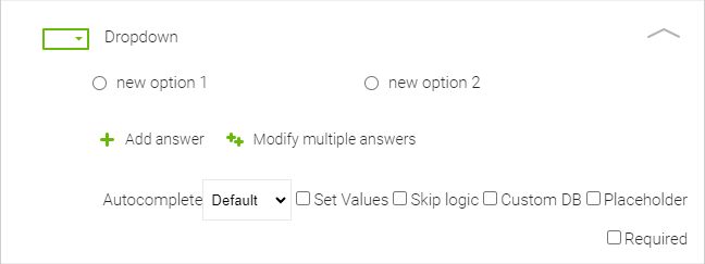
Here is how the Dropdown component will look once you have dragged and dropped it into your new form.

By clicking into Dropdown, you can insert text allowing you to provide a question for the choices.
By hovering over the New option fields you can set up the relevant choice options for the data required by clicking on the pencil icon. You will also see a Delete icon should you wish to remove the choice option.
You can easily create more choice options for the interviewees by clicking on +Add option and go through the same process.
When you click on Modify multiple options you can separate the options with a new line. Modifying multiple answers is very helpful when you have a longer list of the answers or if you need to copy the options from one question to another. You can also reorder the answer options in the popup window or if you want to make the list alphabetical, just click on the A-Z button in the top right corner of the pop up.
Once you have made these changes, remember to press the update button to close the window and resave your form.
You can see five checkboxes at the bottom right of the component:
Autocomplete: Allows you to set the use of Autocomplete. By default Autocomplete is displayed if the Dropdown contains more than 100 items. The options are to leave this in Default mode, Always in Autocomplete mode or you can choose to have Autocomplete Disabled
Set Values: allows you to set a numeric value within the individual answer option for calculation. Find out more about this option on the calculate help page.
Skip Logic: Allows for setting Skip logic.
Custom DB: Allows you to prefill your own internal DB data into the NestForms responses. This can be an Excel document or CSV that you have exported from your own internal Database.
Placeholder - This feature allows you to provide a text prompt for the responder.
Required: Checkbox ‘Required’ lets the responder know that the question must be answered. If the Responder leaves the question without an answer, and presses Finish, the error appears and the response cannot be finished until the question is answered.
Example: Dropdown component used in a Music survey #
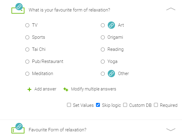
In the example below a person has been asked in an earlier question if they enjoyed music. If they have answered ‘No’ the dropdown component has been linked using Skip logic and provides a list of alternative pastimes.

Responding in the app #
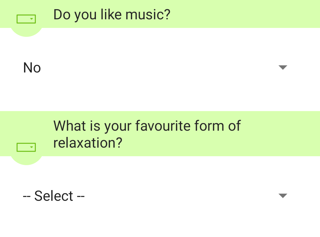
This is how it looks for your responder on the mobile app.

By pressing the Dropdown arrow to the right of --Select-- the interviewee must make a choice from the list provided. If their preferred pastime is not on the list, Skip logic has again been used to link the choice ‘Other’ with a Text component where they can enter text to say what they do to relax.
The Dropdown component is very easy to use both for the administrator creating the form and the responder collecting data on the ground. You can also view the full list of the components and their uses within the NestForms app.


