
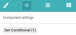
Please note: The Custom PDF builder is only available on Premium subscriptions (or via an additional paid module for Standard and Advanced subscriptions).
Custom PDF #
The Custom PDF builder allows you to customise your PDF export in many different ways. You can change the appearance of the document by selecting different layouts and formats, adjust headings, include branding and images and many other features.
When you are in Reports, mouseover Exports, then click to Export Settings. Then click to PDF and switch to the tab called Layouts, and then either press Add new or edit an existing one.
Branding is important for many clients when producing their final reports. When using Custom PDF as a Premium subscriber you have the option to remove the NestForms brand from your final reports. This feature is also available to Standard and Advanced subscriptions as an Additional paid module.
Removing the NestForms logo #
This is available as an additional paid module called Fully Customised PDF (allows you to customise your logo in PDFs) and is unlocked when you subscribe for it.
You can do this when you go to the Reports page, mouseover Exports, click to Settings, then click to the PDF icon, click to the Layouts tab and click to Unlock module.
You can trial this for 24 hours once you remember to disable this module in your profile. Once you disable it within the 24 hours, you will not be charged anything extra.
Learn how to remove the NestForms logo.
Custom PDF Builder #
Custom PDF Builder allows for the creation of customised PDF layouts that can be used when exporting responses. When creating a customised PDF layout you have full control over both the content and style of the final generated PDF.
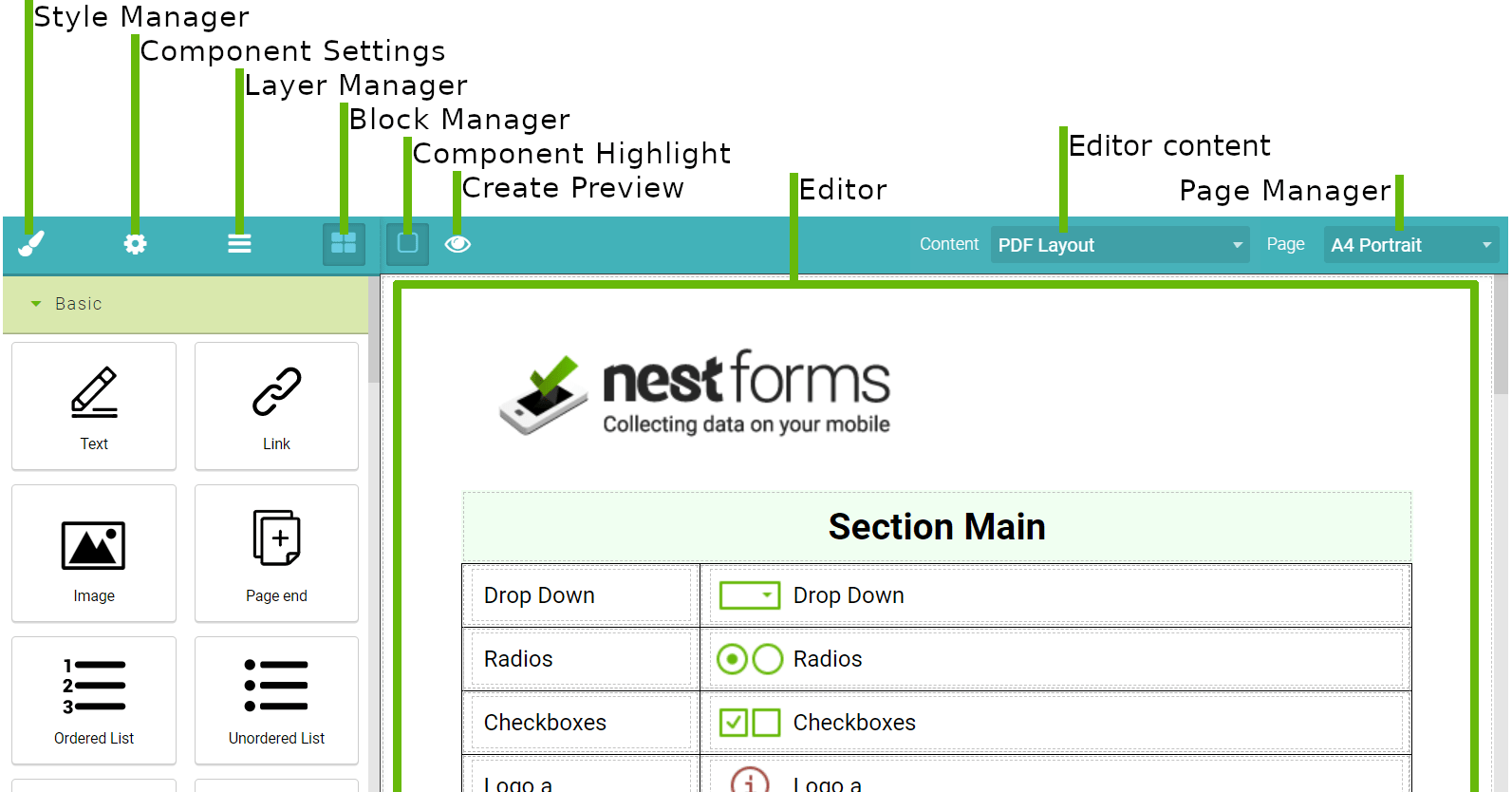

Page Manager #
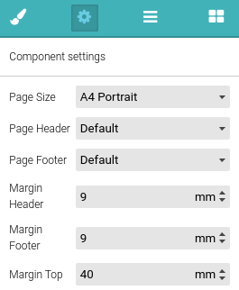
Page Manager allows you to change the page size and page orientation that will be used for your PDF. Note that since the editor does not use pages it will just change its width, however in the export itself, the correct width and height will be used.
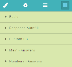
Block Manager #
Block manager stores all of the components that can be used for creating your custom PDF layout. You just need to drag and drop them inside the editor. Individual components are grouped in sections. Some components e.g. Table allow other components to be placed inside, while others e.g. Page end can be placed only inside the editor. Autofill components can be placed inside both normal block components e.g. Table, Unordered List and also the Text component.
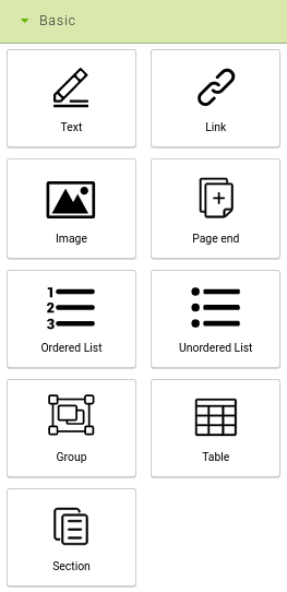
Basic Blocks #
These components are used when creating the basic structure of the PDF.
Text
Creates static text and can contain autofill components.
You can add any static text into your PDF. You can easily change the boldness of the required text by highlighting it and then click to B in the toolbar.
Link
Allows for the creation of links. The target of the link is set inside Component Settings.
Image
Creates a static image. When dropped inside the editor, a window will open and that will allow you to select an image from your uploaded images or upload a new one.
If you want to add an image from a response, you need to look at the Answers Block section.
Page end
Adds a page break to the PDF. Because the editor does not use pages this will be represented only by a component that fills the whole width of the page which will separate the content. It can't be dropped inside other components.
Note that when exporting, if the content can’t fit within a single page, the page break will be added automatically.
Ordered List
Creates an ordered list. Other components can be placed inside including another ordered list.
Unordered List
Creates an unordered list. Other components can be placed inside including another unordered list.
Group
Other components can be placed inside to create groups of components for easier manipulation. Additionally you can use Group to allow export of repeatable sections. All you have to do is set which section the specific Group should act as and then place only questions from that section inside this Group.
Table
Creates a table. Other components can be placed inside. When dropped inside the editor, you can specify the number of rows and columns the table will have through the dialogue box that will open. When a cell is selected, rows or columns can be added, deleted or merged.
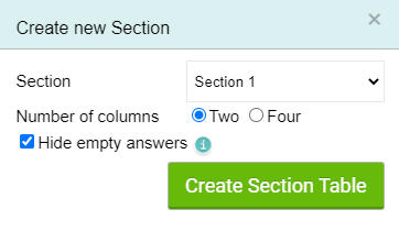
Section (Autofill Table)
This component will automatically create a table from a section that you have created within your form.
You can choose whether the resulting table will have two columns (label, value) like a standard PDF export or four columns (label, value, label, value). You also have the option to automatically create conditional rules to hide items without answers. The created table will be automatically placed inside a Group component and set up to work with repeatable sections.
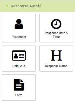
Autofill Blocks #
This is a replacement for the autocapture question. Special types of components which can be placed both inside the normal block e.g. Table and also the Text component. Their value is calculated when exporting to PDF based on the individual response.
Responder
Adds information about the responder based on the settings of the component.
Default: First name
Available: First name, full name and email address
Response Date & Time
Adds information about the response based on the settings of the component.
Default: Modified from App
Available: Modified from App, Modified to Web account, Created in App and Time taken to complete.
Unique Id
Adds a response with a unique ID.
Response Name
Adds response name.
Form
Adds information about the form based on the settings of the component.
Default: Form name
Available: Form name, form link
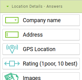
Answers Blocks #
These are the questions you have used in your form. Individual blocks are grouped by the sections in your form. Their value will be replaced with the responder's answer when creating an export. Many of these blocks have additional settings which can help you customise how they will display. You can read about these settings in detail in the section Component Settings.
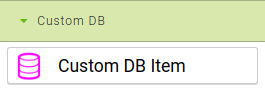
Custom DB #
The Custom DB Item block allows you to add values from one of your custom databases to your Custom PDF. This block is only available if the form for which you are creating a Custom PDF has a Custom DB set.
The value of this block in the exported file depends on what Table and Column you set in the component settings and what row is selected by the responder. Both Custom DB Table and Column must be set for this component to work.
Component Settings #
Shows the available settings for the currently selected component. Some of the components can either be displayed as blocks or as inline elements. This is controlled by the checkbox Display inline. Inline elements can be placed inside the Text components and don't force a newline after them, while block elements cannot be placed inside the Text component but do force a newline after them. All components that represent questions, table rows and cells can have Conditional settings that control how the component will be displayed based on the response data. Conditional settings are explained in the section Conditional Settings.
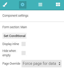
If you do not wish to show the “-- no answer –” value you can either use the Conditional Settings for display or just check the Hide when empty checkbox in the component settings.
Normally when exporting PDFs with repeatable sections the sections will be placed one after the other. However if you wish to show data only from a specific cloned section you can use the Force page for data. The pages are indexed from 0 so if you wish to show only values from the first clone set the setting to 0, if you wish to use only values from the second clone set the setting to 1 and so on.
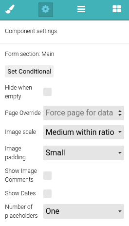
Images Settings #
Settings for the Images question.
- Image scale: Controls how images are scaled
- Image padding: Defines the space between images.
- Show Image Comments: Controls the display of comments for individual images
- Show Dates: Controls the display of uploaded image dates
- Number of Placeholders: Controls how many placeholder images you will see in the editor. This does not affect the final export.
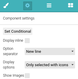
Radio and Checkbox Settings #
Settings for both the Single Answer and Multiple Answers questions.
- Option separator: Controls how the individual options are separated.
- Display options: Controls how the options are displayed.
- Only Selected: Shows only the selected options.
- Selected with icons: Shows selected icons with a ticked checkbox next to the option
- All with icons: Shows all options with the icons (including options that were not selected). Selected and non selected options will have appropriate images displaying their status.
- Show Images: Controls the display of the related option images.
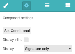
Signature Settings #
Settings for Signature question.
- Display options: Controls how the Signature will be displayed
- Signature with Date: Shows both signature and date in format set in member profile.
- Signature with Date and Time: Shows both signature and date with time in a format set in the member profile.
- Signature only: Shows only signature.
- Date and Time only: Shows only the date with time in the format set within the member profile.
- Date only: Shows only the date in the format set within the member profile
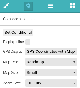
GPS Settings #
Settings for GPS Location question.
- GPS Display: Controls how the GPS will be displayed.
- GPS Coordinates: Only the GPS coordinates will be shown.
- Only Map: Only map will be shown. Map is controlled by further settings.
- GPS Coordinates with Map: Both GPS coordinates and the map will be shown. Map is controlled by further settings.
- Map Type: What kind of map should be used.
- Roadmap: Standard Google Maps.
- Satellite: Satellite image of the location.
- Hybrid: Satellite image of the location with information from a roadmap overlaid on top.
- Terrain: A Map that shows terrain with information from the roadmap overlaid on top.
- Map Size: Controls map size. Map will always be displayed as a square.
- Large: 400px
- Medium: 300px
- Small: 200px
- Zoom Level: Controls the map zoom level. Available values range from 1 (World) to 20 (Buildings).
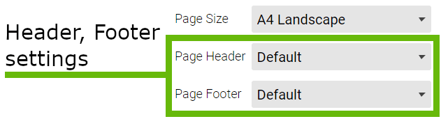
Page Settings #
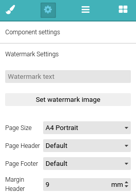
Settings for a PDF watermark and margins. Select the Body to edit (eg by clicking anywhere outside the main content area). Leave this empty if you don’t require a watermark. Note that since the editor does not use pages the watermark will scroll with it, when exported the watermark will be applied per page. Additionally you can also change individual page margins, your new margins will be used for the whole PDF. If you wish to change the margins for another page you can do so using the Page Break. The margins set using the page break will be applied until the end of a file or with any further page breaks.
Page End Settings #
Allows you to change the margins, page size and orientation of consecutive pages. These changes are kept until the end of the file or until another Page End is used.
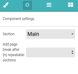
Group Settings #
Set if the Group should act as a section. This is required for the repeatable section to work properly. If you do not use the Group for a repeatable section, then only the first clone will be exported. If it’s used as a section, questions that don't belong to that form section should not be dropped inside as they will not work properly when exporting.
Adding a page break after {n} repeatable sections
This setting is only available if the group is set as a section. Using this setting you can set the number of cloned sections, after which the page break will be added. This can be useful for example when you want to always have at maximum three cloned sections per page.
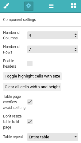
Table Settings #
Settings for the Table component.
- Number of Columns: Controls the number of columns in the table. Columns are added/removed from the right side of the table. Note that when columns are removed the content in them is removed as well.
- Number of Rows: Controls the number of rows in the table. Rows are added/removed from the bottom side of the table. Note that when rows are removed the content in them is removed as well.
- Enable headers: Switches the top row from standard cells to table header cells.
- Table page overflow avoid splitting: If enabled tables will not be split between pages. This is achieved by either shrinking the table to fit the page (to about 70% of its original size) or by moving the table to a new page. Note that this setting works only on tables that do not span multiple pages.
- Don’t resize table to fit page: If enabled tables will not be shrunk to fit page.
- Table Repeat: If the Table is placed inside a Group that is used for a repeatable section, then the setting Table repeat will be available. If this setting is set to Entire table a separate table will be created for each cloned section. If it is set to Selected rows then only one table is created and individual rows will be cloned (these rows must be set - see the Row Settings).
To make working with tables easier you can use two buttons. The Toggle highlight cells with size button will highlight cells that have changed size and the Clear all cells width and height will reset the size of all cells.
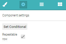
Row Settings #
The setting for Repeatable row is only available if the table that the row belongs to has the setting Table repeat set to Selected rows. This setting controls which rows will be used for repeatable sections. Rows that do not have the Repeatable row checkbox ticked will appear only once, but the rows with the Repeatable row option checked will be repeated based on how many cloned sections are within the Response. This allows you to create a table that has a header and row for each cloned section, however if the group contains other components besides a table, then the created table will be cloned for each repeatable section.
Example video using the clonable section #
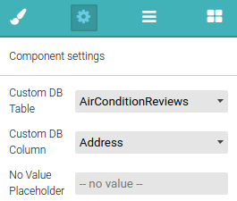
Custom DB Item #
Available settings for Custom DB Item:
- Custom DB Table (Required): sets from which table the value will be taken.
- Custom DB Column (Required): sets from which column of the above table the value shoud be taken from.
- No Value Placeholder: text that will be used when no value could be found. Default: -- no value --.
You should note that both the Custom DB Table and the Custom DB Column are mandatory and have to be set for this component to work.
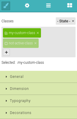
Style Manager #
Style manager allows you to set the style for individual components. When styling components by default, the style will apply only to the selected components to prevent having to set multiple components with the same style. You can create a Class that can then be set to components that you wish to change.
A class is created by clicking on the plus sign in Classes.
The checkbox next to the class name works for selecting the class you are currently styling. Styles will apply to components that match the Selected condition which can be seen under Classes.
Example of Selected values:
- Styles will only affect a specific component:

- Styles will only affect components with a class:

You might notice that some labels have a different colour other than black, these colours give you information regarding the value:
- Non default value, this value was changed.

- Inherited value, this value was inherited from one of parent components.

Note: If you are making changes to the style manager, you should have some basic knowledge of HTML as well as CSS.
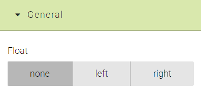
General
Allows you to float components to the left or right. Note that when used on a component that is inside a Table this setting will be ignored.
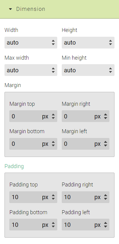
Dimensions
These settings allow you to set the size, margin and padding of the component. Note that when used on a component that is inside the Table these settings will be ignored.
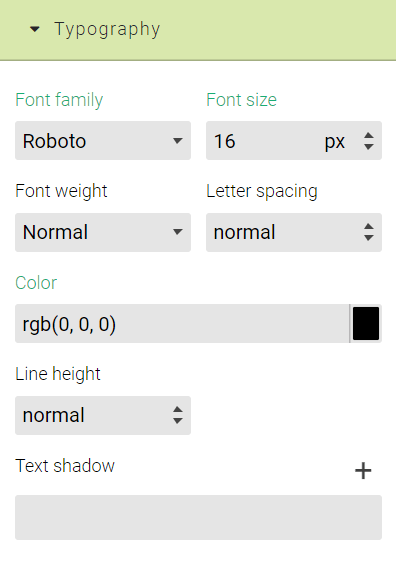
Typography
Here you can set styles regarding the font family, font size, font weight, letter spacing, colour, line height and text shadow. You can use the colour picker to set the colour of the text or shadow. To show the colour picker click on the black box (there might be a different colour if it was changed) right of the colour input.
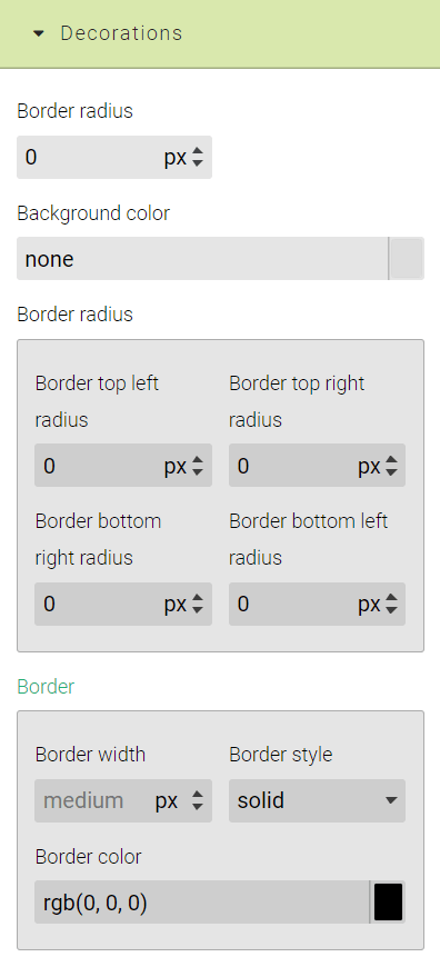
Decorations
Here you can find the border, box shadow and background settings. You can also use the colour picker to set any of the colours.
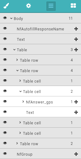
Layer Manager #
Layer Manager allows you to see the tree structure of your PDF layout. Here you can quickly hide or move individual components. When hovering over an element inside the layer manager, the corresponding element is highlighted in the editor.
Conditional Settings #
All the questions have a special setting called Conditional that controls what happens with the selected component based on the answer to some questions.
The number of conditions currently applied to the selected component are displayed in brackets.
Conditional Display
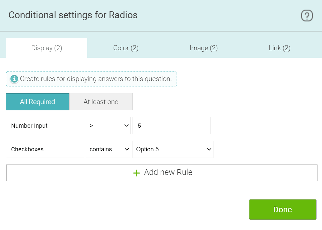
The Conditional display controls when and why the questions will be shown in your report.
In the above example Radios (Single answers) will be shown when Checkboxes have checked Option 5 and the Number Input is greater (>) than five.
This is because the All Required option is selected.
If At least one is selected, then only one rule can be displayed.
Conditional Colour
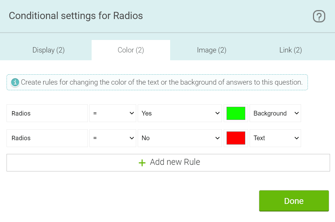
Conditional Colour controls what colour either the background or text will be. In the above example Radios will have a green background if Radios has Yes checked, if No is checked a red background colour will be used. Unlike in the Conditional Display, Conditional Colour doesn't have a setting for how many rules have to be true to be applied. Simply put, if the rule is true the colour will be applied. If there are multiple rules that all control background or text colours are true, then the last one will be used.
Conditional Image
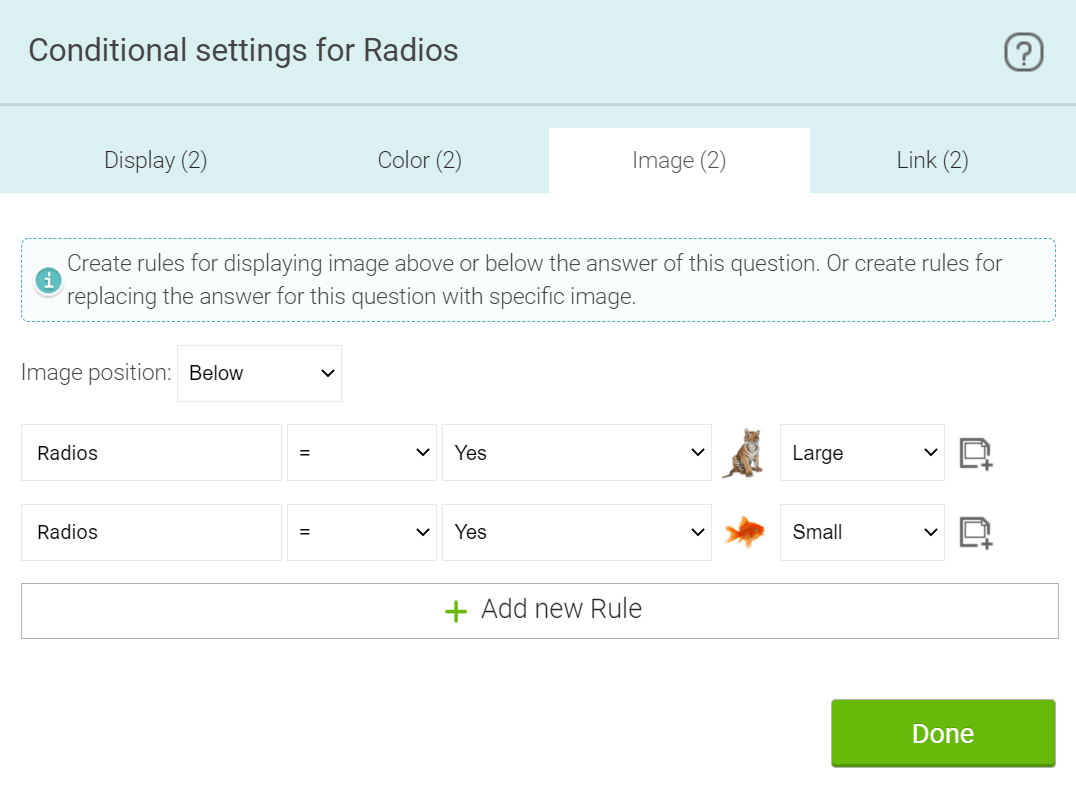
Conditional Image controls when to show images that you specify either next to, or instead of the answer. In the above example if Radios has Yes checked, the specified image will be shown instead of the answer. If Yes is not checked, the other specified image will be shown instead. You can set different images and image sizes for each rule. You can set the position of the image with the dropdown available. Values are: Above, Below and Replace. This is similar to when the Conditional Colour and Conditional Image doesn't have a setting for how many rules have to be true.
Conditional Link
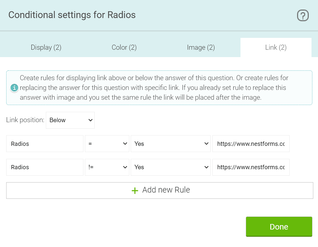
Conditional Link works identically to Conditional Image but instead of using images it uses member specified links.
Custom Headers and Footers #
You can create Custom headers and footers to use in your PDF. You can create new custom headers and footers by clicking on the Content dropdown and selecting Create new custom header or Create new custom footer.
After setting, you can customise the header and name just as you would a PDF layout. When you are finished with your custom header or footer use the Content dropdown to switch back to the PDF Layout. You can then set the header or footer in page settings. If you want to use a different header or footer for different pages you can set it with the Page end component.

Preview #
When you apply your changes, you can click to the Preview icon in the top bar and a PDF document of the latest response will be generated. You don’t need to save the PDF template, so this can be very useful when you just want to confirm how your changes will look.
If your form has no responses the preview can't be generated.
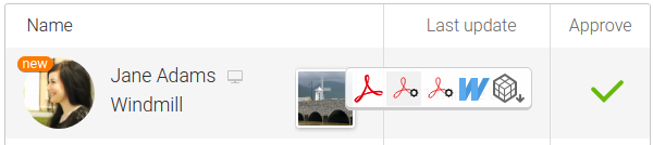
Exporting your results #
To generate your fully customisable PDF report, just go to the Reports page, mouseover your response and you can see a PDF icon displaying a cogwheel for each custom PDF template you have created. When you click on this icon, the PDF will begin to download.
Triggers With Custom PDF Layouts #
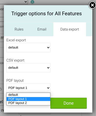
You can also set Custom PDF Layout for your Trigger exports. The setting is found inside the Data export tab of individual form options. The Custom PDF layout will be applied only when using a PDF enclosure with instant Trigger or with the Multiple PDF enclosure.
Repeatable rows use #
Custom PDF allows you to create a single table where rows will use values from repeatable sections.
To achieve this, follow these steps:
- Check that your form has a repeatable section already set.
- Add a Group component to the layout.
- With the group component selected, click on the component settings option and set the Form section that the group should receive data from.
- Add the table component into the group component.
- With the table component selected, click the Component settings option and set the Table repeat option to Selected rows.
- Create the header row for your Table based on your requirements.
- Add the Form components to the row below the header row that you want to fill the table.
- Select the table row with the Form components and go to the Component settings tab and tick the Repeatable row option.
Now when you use the Custom PDF layout, the table will have rows that correspond to the clones of the repeatable section.


Examples #
Note: You will see blue information boxes inside the example PDFs for a further explanation on these examples.
- Example 1a, Example 1b: Response with cloneable sections and hidden rows based on the conditionals rules. 1b is displaying a cloneable section as a row in the table.
- Example 2: Response with different page styles (A4 portrait, A4 landscape)
- Example 3: Different table styles - Looks like an official form.
- Example 4: Advanced graphics - Different headers and footers in sections, Static images added to the content. Images from Responses added in different formats and sizes. Display GPS coordinates collected in the Response on the Map with different settings.
- Example 5: Two and four column layout example that is autogenerated by dragging the Section component to your PDF layout.
- Example 6: Adding a watermark image and/or customised text to the PDF background.