The Images component provides you with a simple way to collect images from your colleagues.
Single or multiple images can be added.
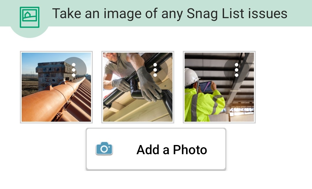
This is how the component looks when you add it to your form.

When you click into Images, you can then change the title heading to make it more relevant to your form. For example, you might wish to collect images for a Health and Safety Audit, a Project Completion Report or Snag List Form.
You will see various checkboxes within the component:
Custom DB - Allows you to prefill your own internal data into your NestForms responses. You can find out more on the Custom DB help page.
Filename - Allows you to change the filename of the image. Once selected the ‘Filename’ field will appear and when you click into this you will see a prefilled dropdown menu for the questions components within your form. You can select a component from the dropdown or enter free text if you require.
Disable images from the Gallery - This can be used to ensure the responder is taking an up to date image as opposed to choosing a previous image from their gallery.
Required - The ‘Required’ checkbox lets the responder know that the question must be answered. If the Responder leaves the question without an answer, and presses Finish, an error appears and the response cannot be finished until the question is answered.
Keep EXIF - EXIF (Exchangeable Image File Format) information records specific technical details within the image that can be considered as private, potential GPS locations, Dates and times of images, camera type, flash, zoom etc. By default we remove this technical information from the images.
If you wish to retain the image technical details, then you should check this box.
Preferred action on click - This lets you choose what should happen when the user clicks to ‘Add a Photo’ in the app. The options are:
- Camera (this is the default setting) - open the camera for the user to be able to take a picture.
- Gallery - This setting allows the Responder to select an image straight from the device gallery.
- Popup - You can provide a popup prompting the responder to take an image with the device camera or select an image from the gallery.
In any case, if the user long touches the 'Add a Photo' button the menu with the options will appear.
Validation Rules - You can specify rules for how text is to be presented in the form responses. You can find out more on the Regular Expression Validation help page.
Inside the app:

When you press the Add a Photo button, the camera will open and you will be able to take a picture.
If the Responder wishes to upload a photo from their device gallery, they should hold the button for about one second and then choose the Gallery option. They can then choose from the different gallery apps installed in the device. Some of these might also allow you to select multiple images.
Drawing on an Image #
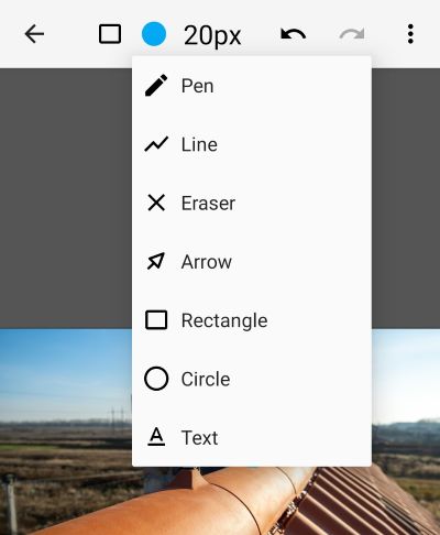
Within any of the images taken or uploaded from the device gallery, the responder has an option to draw over or make various annotations.
Examples include a Health and Safety Auditor being able to circle or arrow a trip hazard within an image. A builder can flag up issues along with text within a Punch List form.
The 3 dots icon button provides a dropdown menu where they can select Edit Image. This allows them to make these insertions directly onto the image with all of the standard drawing tools (the tools may differ slightly dependant on whether the device is Android or iOS).

Read Image Content with ChatGPT #
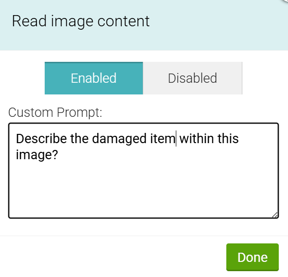
This feature lets you ask questions about images uploaded in your forms and get written answers automatically. When a photo is submitted, it can be sent to ChatGPT along with a question prompt you define, allowing the image to be read and described in text.
It’s useful when you want more than just visual proof. Instead of reviewing images manually, you can capture observations, checks, or summaries directly from the photo and store them as part of the form response.
It's really easy to set up within the component. Just follow these steps:
- Click to Read image content button within the image component settings.
- Enable the option
- When setting the first time, you will be asked to use third party service approval.
- Custom Prompt - This is where you insert your question for the image.

You can now see the ChatGPT descriptions within the image for specific forms on the responses page.


